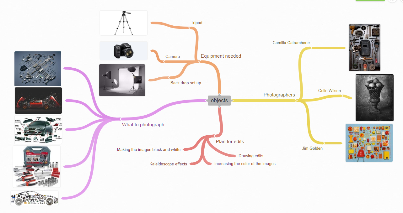
Statement of intent
My theme texture
I will produce a website of work to demonstrating my ideas, development, creative work and reflection based around the theme of the ‘Texture.’ At the end of my coursework time, I will choose my best Photographs and present them in a final gallery.
For my initial research I will start by looking into ‘object’ photographers. At the moment, I have three in mind that I want to look at. These are Joseph Cornell, Colin Wilson and Camilla Catrambone. I chose Joseph Cornell because he’s a contemporary photographer that documents meaningful items and I think that I can gain a lot of inspiration from my own work. I really like the juxtaposition of beautiful objects that are documented decaying, I could think about a time-lapse film as well.
I chose to look at Imogen Camilla Catrambone photography ’ as her work focuses on Texture and I feel that the black & white imagery not only brings out the texture but also looks professional and striking. It would be a good contrast to the other photographers and will help me decide in which direction I want my work to go in.
I also hope to look at the work of Colin Wilson and in particular his series of ‘important to people images that link to someone’. I feel that his work is abstract and beautiful and will inspire my own photography. It will also allow me to work in ‘close-up’ and I could try using a different lens.
When I chose this theme, my initial thoughts were of mechanical textures such as cogs, metals texture, engines and cars. After thinking about the project title more thoroughly I realize there are so many more routes for my work to go down such as natural textures, how I could combine and contrast the different textures and if I could do studio shots as well as going outside on location. If I get a range of different textures, this will allow me to have more images to experiment with and contrast, once refining my work in Photoshop
To show progression through my work I will start by photographing the lego cars and tools that I can bring into school. I will then develop these images further by taking more ideas from them and editing them in Photoshop. I then hope to venture from within Manchester/Stretford and gather Texture images from the environment around I already have a lot of ideas running through my head for this project which will propel me in the right direction
I have 4 months to produce my Website of work towards the production of my final piece. I aim to complete my initial research within the 4 week and start photographing by the 5th week in order to give me the time I need to show progression. I will then continue to develop my work in photoshop and be prepared to go out again with my camera and capture new images to enhance my project. When I have completed the project, I will select my best photography outcomes and display them in my final gallery
As my project progresses I will use annotations throughout my webpage labeling my ideas and development clearly. This will also help me to reflect on the work I produce. I will mainly seek advice from my Tutors and my peers on how to make my work better, as I’m always aiming to push myself to new levels. I will also watch tutorials and demonstrations and find my own as well to help me develop my skills and knowledge of Photoshop. After the creation of my final portfolio I will write a final evaluation on the project as a whole, reflecting on what went well and what I would do differently or change given the time.
mind map
Joseph Cornell
CONText
Cornell hardly ventured beyond New York State, yet the notion of travel was central to his art. His imaginary voyages began as he searched Manhattan’s antique bookshops and dime stores, collecting a vast archive of paper ephemera and small objects to make his signature glass-fronted ‘shadow boxes’.
These miniature masterpieces transform everyday objects into spellbinding treasures. Together they reveal his fascination with subjects from astronomy and cinema to literature and ornithology and especially his love of European culture, from the Romantic ballet to Renaissance Italy.
Five things you need to know about Joseph Cornell He was a quiet pioneer One of the 20th–century art world’s most unassuming characters, Joseph Cornell was also amongst its most original and inventive. Cornell is best-known for his ‘shadow boxes’: modest, glass-fronted constructions which transport the viewer into imagined realms.
His art arose from collecting Cornell loved to roam Manhattan’s dime stores in search of antique books, postcards and small objects, gradually amassing a vast collection of treasured finds. These would become the raw materials for his highly personal form of art.
He saw himself as an "armchair voyager" Cornell never left America in his life, yet his creations offered him a way to travel through the centuries of history, the continents of the globe and even the celestial realm. His work is filled with a yearning for distant places and times.
He was a connoisseu of a huge range of subjectsIn his many and varied interests, Cornell did not differentiate between the arts and sciences, nor between high-brow culture and popular entertainment. He saw Hollywood starlets, 18th–century ballerinas and Medici princesses as equally worthy subjects for his art.
He was on the periphery of great art movements
Cornell lived an eccentric and extraordinary life. But while he is often characterized as an outsider, he was surprisingly engaged with the Avant grade art movements of his time. He exhibited with the Surrealists, befriended artists from Marcel Duchamp to Robert Motherwell and continues to influence art today.
All of this information is taken from https://www.royalacademy.org.uk/exhibition/joseph-cornell
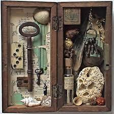
COMPOSITION
The composition used in this image is made up of two section however my eyes are immediately drawn towards the big rusty key being the biggest item in the center of the left box. I feel that my eye is drawn to the brown rusty colour of the key because the background is a natural light cream colour. These colours being opposite in tone complement each other and allows the eye to pick up the detail and aging of the key. The objects in the photograph has been framed in a way that further enhances each individual object because of the colours used. This makes me see the objects as a collection of items that are precious or meaningful to the owner as they have displayed them so carefully and kept them safe in the box.
The right hand side of the box is more dull in colour compare to the left hand side of the box. I think this creates a sense of mystery and may be represent a bad memory.
The objects are closely compact together compare to the left side which has more space and is lighter in colour representing good memories. The lighter colour and discoloration adds to the feeling of aging it looks like the key has been used for decades.
I can see the image has been created using a studio set up as the items have been displayed and set up so carefully and precise. This has allowed the Photographer to control the lighting, I feel that the lighting has been positioned more on the right side as I can see the reflection in the bottle and on the chain. I think this has been done to add brightness to the objects due to the darker colours used on the inside of the box.
When looking at this image the way it has been carefully framed and put together makes me wonder how old each item is and how long they have been together. I'm also drawn to the right side of the box as the textures and detail of the rocks, keys and bottle can be seen within the layers created.
I feel the WB would be auto and the ISO auto due to the image being taken in a studio set up and that the image does not
look to warm or to cold. I feel the rule of thirds has bee used as the middle off the box the opening is in center creating a leading line of the outisde frame making your eye follow the brown board all the way around.
CONNECTION
This links to my work because I have chosen objects for my question and I like the framing of the object and the fact all the objects are put in the box neatly and thoughtfully. This image will inspire me for future photos I may do the same sort of style for my shoots and create a similar photo or at least take the inspiration of having a collection of items together.
COMMENT
I like the look of the image, the way the lighting has been used to highlight certain objects . What also appeals to me is the way the items have been thoughtfully placed so you can see all the object clear even though it is in a small box the objects are of similar colours and I like the front facing view it has been taken from and the fact the objects are places in a way they create layers.
colin wilson

context
Wilson is a contemporary British photographer focusing on still life working with black and white film and meticulously printing his own work
Welkom to Colin Wilsons Photography website.
Born Oct. 1955 in Dorking England
Living in Arnhem, the Netherlands Since 1982
Colin’s autonomy work can be described as reality with
a twist, which it’s self creates a new reality.
The photo’s in the galleries are printed on high quality
photographic material and are acid free mounted or framed.
Light and dark are continuing themes in this work and are taken further in the series
(All information in the context paragraph has been sourced and copied from the internet.)
COMPOSITION
The objects in this image have been placed in the center giving a symmetrical feel.
The lighting has been placed on the left hand side as the objects appear to have lighter areas on the left hand side.
The colours of the objects are close to the back ground colour which ae shades of black silver and browns. This is defiantly a studio set up, at first glance I though an infinity curve had been used for the background however on closer inspection I can see a slight tone difference from top to bottom of the background which suggest that a slightly lighter backdrop has been used. The objects being placed on a table with at dark base colour used before the items placed on top.
My eyes are instantly drawn towards the object in the center due to it being in the center. The lighting then makes my eye be drawn to the texture on the bottom object which takes up half the image.
The detail of the objects show the age with rust spots making it look like its been used for a few years. Then my eyes look around the image but I feel the use of dark colours are what make these objects become a collection and it creates the connection of these items maybe belonging to a person, perhaps an older man whos had the vase for many years this is what I think when I take the whole image in.
connection
This links to my work because it is an photograph of object and the center focus of the image will inspire me for future photos to do the same sort of style using a limited about of colour for my shoots and create a simple but effective photo.
COMMENT
I like the look of the image even though they may be a bit dark for my taste but he has a good lighting so you can see the object clear even though it is dark all the photos are a similar colors and I like the view it has been taken from and the fact the object is in center of the image.
mood board


camilla catrambone
context

Camilla Catrambone is a portrait photographer of sorts, yet her carefully arranged images -- homages to her family members -- feature no smiles, faces or even bodies. Instead, the Florence-based artist creates photographs of her relatives using personal belongings, ranging from leather satchels and handkerchiefs to blocks of cheese and cookware.
Camilla Catrambone has chosen to shoot her family’s portraits in such a personal way, yet allowing the viewer to create their own mental image of what the owner of these cherished, much used items would look like in the flesh.
The series, simply titled "Portraits of my Family," shows these everyday treasures arranged in aesthetically organized, curiously captivating snapshots. "When I started doing this project, I felt that the objects belonging to my relatives, starting from the ones of my beloved grandparents, were still full of energy and were capable of reminding me of moments I shared with them," Catrambone stated in an email to The Huffington Post. "I started to feel the need to use them to go back to a precise memory."
I got this info from https://www.estliving.com/camilla-catrambone-family-portraits/
COMPOSITION
The composition is very good to me my eyes are instantly drawn towards the blue circle object due to it being lighter in colour than anything else in the photograph. The way its has been framed further enhances the age of everything in the image everything looks old and has rust spots and the discoloration makes it look like the objects have been well used. The lighting has been placed on top of the images making everything meatal appear light, but I also feel as though this image could have been taken in a shed with natural light coming through a window as to me the edges appear darker in colour. My eyes then look around the image and I notice that the object have been placed horizontal except two objects which are vertical this creates another frame capturing the textures and aged of the objects. The hammer is the biggest object in the image which hasn't got as much texture on it is smooth compared to the paint scraper. I think this helps balance the image as you have time to take in the detail captured, although the items are rusty they have been placed in a very neat and careful manner almost as if someone has measured the spacing between the objects.
When I take the whole image in I try to connect these items to a person perhaps an older man whos had them for many years .
When I take the whole image in I try to connect these items to a person perhaps an older man whos had them for many years .
connection
This links to my work because of the framing of the objects and the arrangement will inspire me for future photos to do the same sort of style for my shoots and create a similar photo.
comment
I really like the look of the image and she has a good lighting so you can see everything even though they are similar colors and I like the top down view it has been taken from and the spacing between all the images.
mood board


my toolkit


best
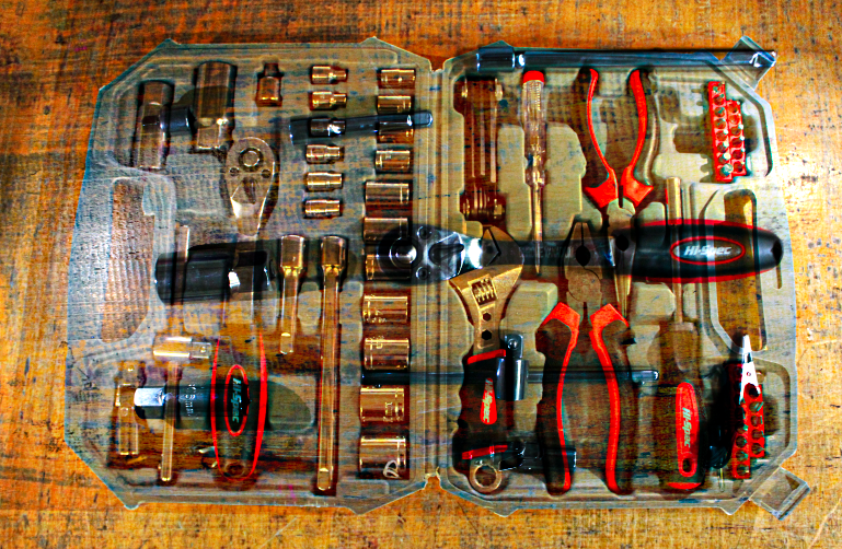
This is my best image because its in focus and the lighting is excellent as well the tools have a nice spacing to them.
|
worst
This is my worst image because you can see the edges of the table as well the picture is ever so slightly out of focus so you cant see the writing on the wretches.
|


before
|
after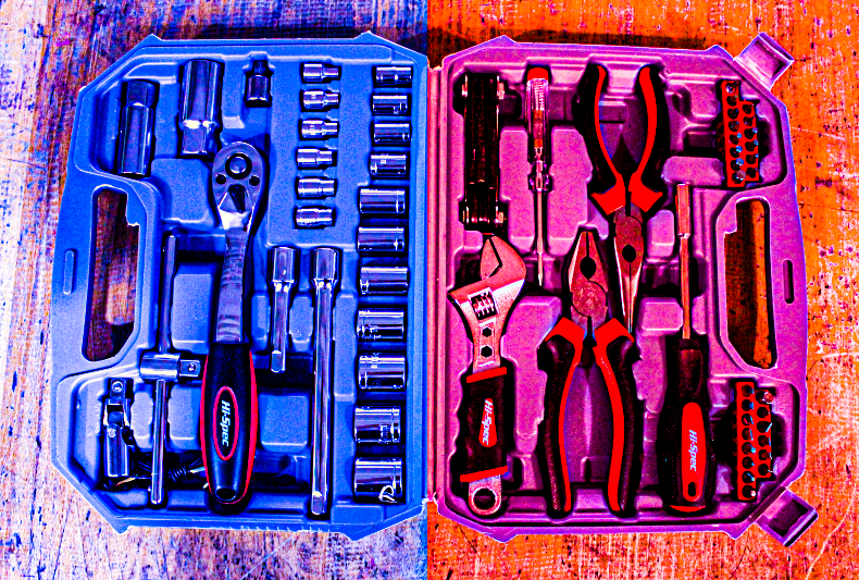
|


best
This is my best image because it is focus and the light isn't to strong on the tools
|
worse
This is my worst image because the light is so brit and only on the right making the tools have a dark shadow
|


shoot plan 2
Shoot 2 objects
I am capturing wooden busses and old tools in a plan view of thins that could be related to people and those given items which is like the images done by JOSEPH CORNELL and I will experiments with diffident lighting and black and white
I am going to take inspiration from JOSEPH ORNELL and his photos
location my house and studio setup
props/items needed car engine tools and car parts
kit needed backdrop lamp and tripod
camera settings I will use f stop will stay the same so no images is to different from the others and probably use 1.4/2 on the setting
white balance I will use lights inside I'm looking for a bright light to highlight the subject
shutter speed will be the same for the photos so the images are similar and aren't drastically different and will mostly use 1/2000 to make sure there is no movement in the image to keep them looking professional
iso I will keep low 100 to 200 to lessen the grain I the photos
which compositional rules will I use I will probably use a central focal point to focus on that object for some other I would like to add color or black and white filter to the image and will utile the rule of 3 in the images as well as leading lines for the images
brush


thing


best
This is my best image because its in focus and you can see all the tools sizes.
|
worst
This is my worst image even though the image is in focus the sun glass reflected on the tools making the back of it over exposed and blinding.
|
drill bits


equipment


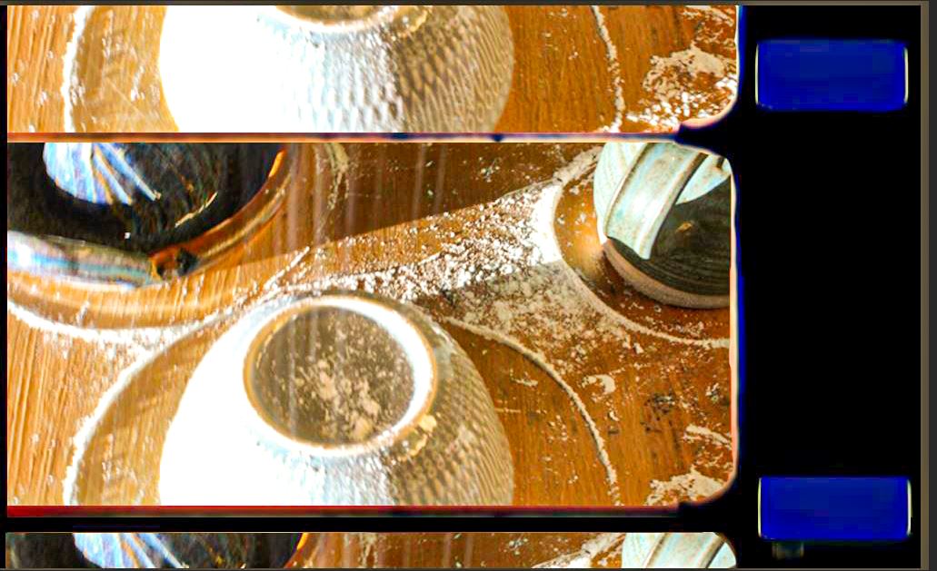
cooking equipment


best
|
worst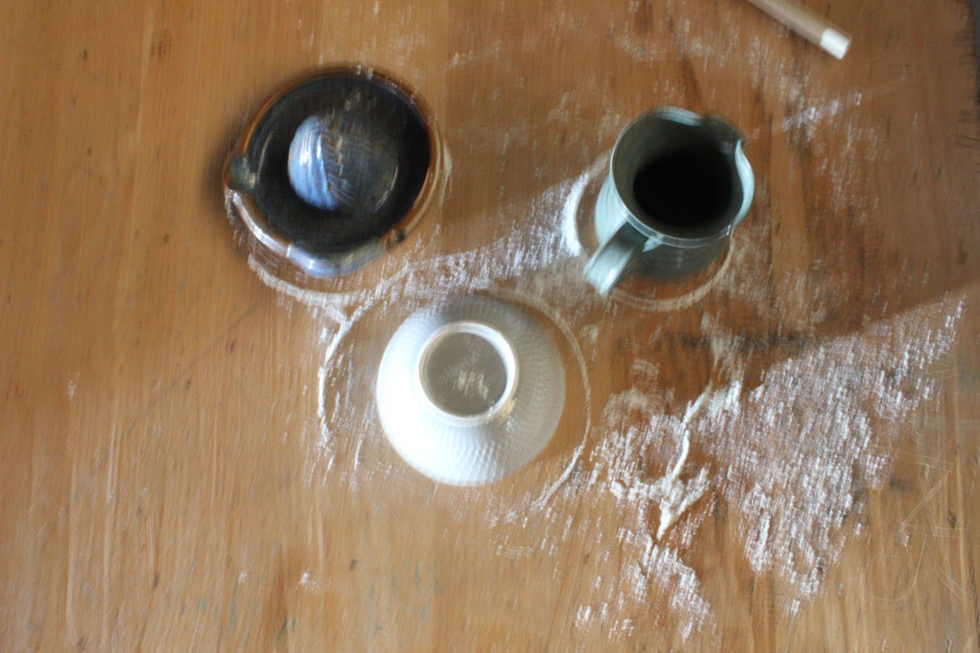
|
|
This is my best image because its in focus and I like the shadow effect and with all the flour it look like the image was taken in a kitchen.
|
This is my worst image because its not in focus there is a lot of noise and its very blurry and the spoon is in the back as well the lighting is a little off.
|


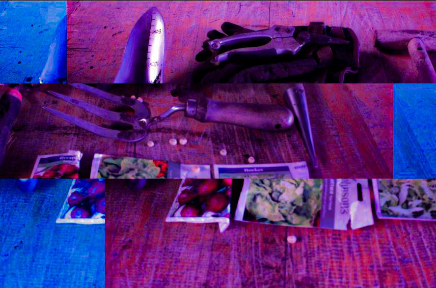
gardining equipement


Snips


photoshop edits
saw and tools


shoot paln
This was me when working with Justin the camera was plugged into the computer and took the photo from there and we experimented with light reflection using a mirror and I took different photo's with metals cogs and different combinations and experiment with different lighting adjusting using a dimmer on the verity of object and changing the background and using a paper cover over the light to change the harshness of it onto the object.


justin shoot


best
This is my best image because it is in focus and is at a god angle with very good lighting.
|
worst
This is my worst image because it is way to dark and you cant see anything.
|
Work done photoshop


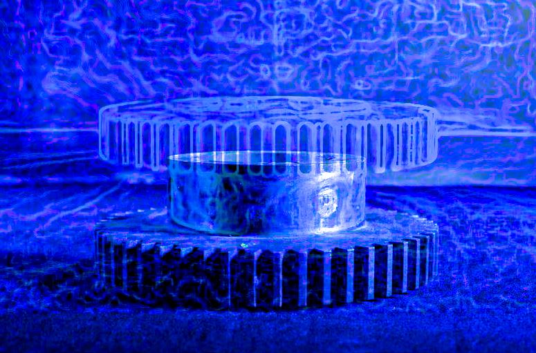
metal cogs


best
This is my best image because it has perfect lighting and is crystal clear even though a bit of mirror in in the corner.
|
worst
This is my worst image because it is too zoomed in and the lighting on the metal on the left isn't bright enough.
|
Work done on photoshop


before
|
after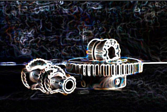
|
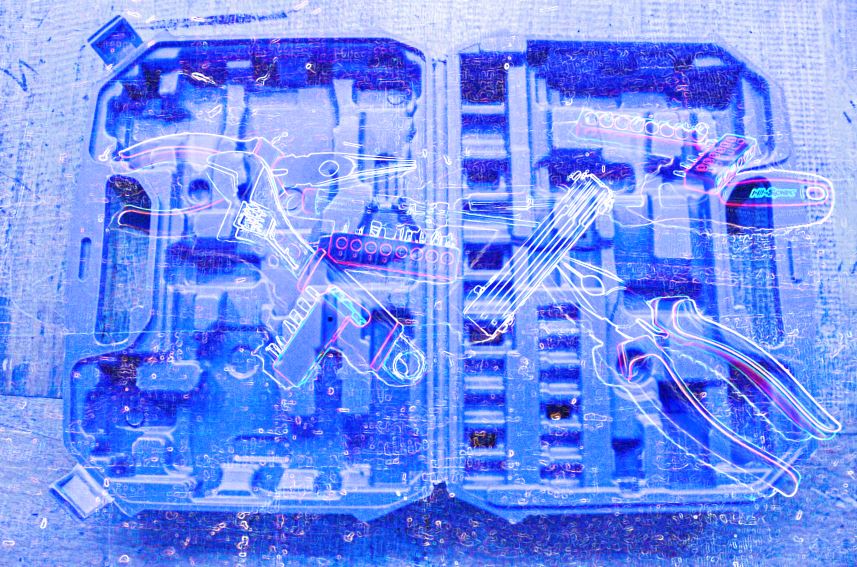
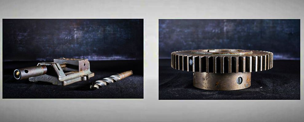
Tools


best
|
worst
|


Worst
This is my best image because it is centered and perfectly lit and the background is in focus.
|
best
This is my worst image because it is to dark and hard to see and the background is over exposed.
|
black and white edit


black and white edits


|
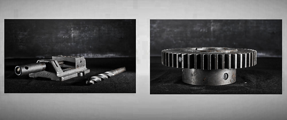
|
double exposure effect on photoshop


DOUBLE EXPOSURE EFFECT ON PHOTOSHOP 2


double exposure tutorial https://www.youtube.com/watch?v=BRScatYWYyQ&t=1s&ab_channel=BlueLightningTVPhotoshop
decay effect photoshop


|
|


|

|

|
shatter effect Tutorial https://www.youtube.com/watch?v=xyBWcjIvn-o&t=8s&ab_channel=CreativeSalek
evaluation
My main theme for my exam project was different objects and I explored the different types, such as, metalwork, cogs and vices.
I thought the theme was good because I was able to take images of objects that I liked, like with the cogs and I was able to do interesting edits with them.
Although the theme may have not been the best, not allowing me to focus on other things I like, I can see that I was able to photograph different objects. I prefer cars and the body lines and paint in the light, not old metal cogs that don't have any reflection. However, the theme allowed me to be creative when photoshopping , using different tutorials to develop my knowledge and skills with filters, layers and specialist brushes.
In photography I found the use of Photoshop the most interesting because I enjoyed manipulating my work and improving the images I took to make something better out of it. This helped me to take my work on a journey and explore different ideas. I have learnt how to Photoshop (e.g. copy and paste layers and use the blur tool). I found some bits difficult like more complicated tools or effects, so I used the tutorials to help me use double exposure and explosion effect, along with fire. I use the bucket, the pen, the crop, the blur, the eyedropper and the quick selection tool when photoshopping, and I am really pleased with my outcomes. However, I would like to develop my skills more in Photoshop e.g selection tool or making it look more blended together.
Actually taking photographs wasn't my favourite part but I did like it more than I thought I would. I enjoyed setting up my studio shots and setting the different backgrounds for the images, carefully lighting the objects. I improved using all of the different camera settings, like WB, ISO and setting the exposure. I improved my knowledge on actual photo shooting as well as on photoshop, as I was able to work with a professional photographer and see how you can set-up a studio properly.When I worked with the professional photographer, I learnt how to keep adjusting the lighting until it was correct and to use reflectors to bounce the light and soften it. In the future I would like to learn about lighting and what looks best on what images and will research how to do studio sets a bit more.
I enjoy building my website using Weebly, I think that my work looks more professional and well laid out and I can add the gallery of images and jpegs in a way that I think makes them stand out.
I found 3 photographers that I like that link to my work , Camilla Catrambone Joseph Cornell and Colin Wilsons. I liked the way they used everyday objects but made them seem special. The photographer who inspired me the most was Colin Wilson as he took photos of one object. As my project developed, I found that this inspired me with my work, using one object but then developing it further in Photoshop. In my opinion, focusing on Wilson gave me a good outcome, I grew in confidence and it helped me to achieve high quality photos.
In the future I will maybe choose different objects to photograph, such as nature or man made and bring in more props of my own. I need to think about Time management and be independent at home and organise my own shoots away from school. However, I am really pleased with the way my work developed, the new photography skills I learnt and the way I researched and developed my ideas in Photoshop.
21st april first exam i will not add any more information or make any changes to the work above


|

|


|

|

|


|

|

|


